...Urgh. As I write this, it's about 7:10am and I've just about (minus the audio drivers, which are proving problematic) finished reinstalling and tweaking my laptop with a fresh install of XP. Its previous lifespan was curbed rather suddenly by a total hard drive failure... Two weeks out of warranty! What a pain. Never mind, this laptop's got a 250Gb hard drive in it now. (250Gb! In a laptop!)
It had set me back a little, as all my Archive Trial drafts and images for this blog were on the broken hard drive - which I've managed to recover most of the data from, thank $deity for the one common S-ATA interface - I plugged the drive straight into my fileserver and ran GetDataBack on it for about 16 solid hours! Loads of clicks of death and horrible noises, and some CRC errors, but I got most of the important data. What have we learnt? ALWAYS keep offsite, physically-separate backups of laptop data... At the very least, a working install ISO with maybe your core apps in. I won't make the same mistake again.
Anyway, I thought I'd just observe that, in keeping with its Christmas Day official release, the iPlayer has been given some official interstitial advertising on the main BBC terrestrial channels, and the whole thing's been given a bit of a facelift:
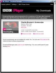
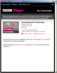 When you download content now, the process is a lot more streamlined...
Not only can you now see the more detailed statistics for each download-in-progress, details you could previously only view in the small dialog which sits by the system tray clock, but you can also enable PIN protection, see information about the peer-to-peer technology behind iPlayer, and enable/disable P2P sharing (the same option found by going to Settings and then checking/unchecking the appropriate tickbox).
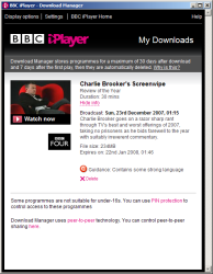
When your show's downloaded...
... and after you watch it for the first time:
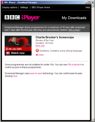
(Left image shows what you see after you watch a programme for the first time after download.
Right image shows the date/month info you see when you mouseover the programme's preview image.)
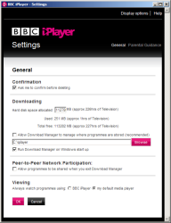
Below is the new iPlayer Settings page. No longer sprawled over several tabs, you have one General tab and one Parental Guidance tab. Again, neater, and neat is good. Display Options still has its own section, where you can define Accessibility options such as custom stylesheets for high-vis display or screenreader-friendly compatibility.
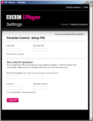
Parental Control has been streamlined a bit, and although I don't use it I know that I wouldn't have trouble configuring it.
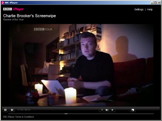
If you click to view a downloaded programme, by default you get the new and improved (read: redesigned) iPlayer... player:
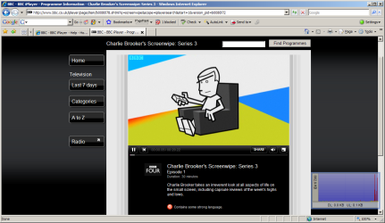
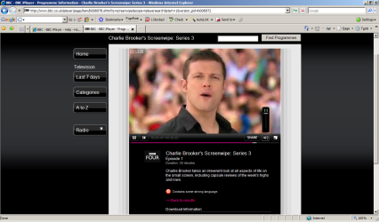
Below is the in-page Flash player. Most people will have to update to the very latest version of Flash to view this content, as (from what I understand) the latest builds of Flash Player support the future ability to include DRM in the broadcasts (if it's not DRMed or locked to streaming from one particular domain already!)
My favourite TV critic's show, playing in its in-page incarnation :)
Have you still not spotted the Spinal Tap homage yet? Here's a clue...
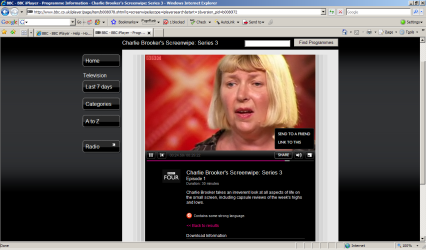
The advantage of having a Flash-based viewing alternative to downloading the Kontiki client is that you can far more easily share programmes with people, and the Flash player offers this via the button right next to the volume mute option.
The iPlayer client employs the same fullscreen method as the legion of other Flash video-based sites, using any available hardware video acceleration to do some nifty smoothing and antialiasing when you go fullscreen, and when you mouse down to the bottom of the screen, you get a thin strip of video controls, also handy for zipping through the programme without having to escape out of fullscreen then go back again.
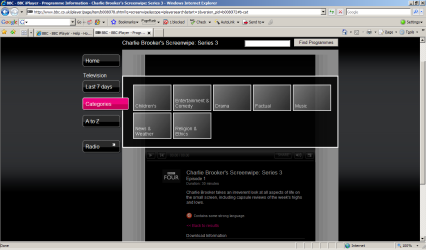
Unfortunately the Flash method is not perfected yet, as the modal options displayed when you click on one of the left-hand-side menus (such as Categories or Last 7 Days), the entire video disappears, although it keeps on playing - and if you click out to close the modal menu, the video displays again at the point it would be if you had kept on watching normally). I'm not sure if this is a browser-specific render issue, but maybe some coding to check whether the Flash window has lost focus (and if so, pause the video, then restarting when you close any menu) would be a nice touch.
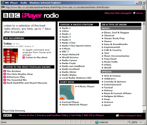
Oh, and the Beeb's decided to rebrand the Radio Player (but not the URLs, yet)... Everything's now under the iPlayer brand, so we are now presented with iPlayer Radio. How very black and pink of them.
So, if you're an iPlayer dabbler, check out the latest incarnation, because it's worth a look (and you may even end up watching something!) The BBC's running trails on its main terrestrial channels at the moment, including one with the Top Gear boys and one with Sir David Attenborough, and their new strapline for the iPlayer is "making the unmissable unmissable."
Personally I can't wait for the iPlayer to come to on-demand cable TV, that'll be way cooler - no chances of triggering STM on your broadband connection that way!
