Sorry for the late update, work reared its ugly head again - and unfortunately I can't blog for a living. I don't make a living from work as it is, but it still takes priority. Curse real life.
Now then, are you familiar with the term 'vertical search'?
Anyway, on one of my recent trawls through the murky, unfinished areas of the interwebs, Spock caught my eye - it bills itself as a search engine for people ("a people search application"), almost an aggregator of sorts. It's not a social network, but you can sign up as a user and contribute your own information (which finds its way to the ether and Spock's listings), or if you're a user who has already been aggregated from some of the sources Spock crawls, you can claim ownership of the information, filling out your profile and letting you add more to complete your entry.
A lot's been made of Spock since its private beta launch, and it's had a lot of publicity already (in general, very positive) - but I thought I'd take the site for a spin myself, and compare it with the other two best-known people search sites out there. I discounted Infospace because it's far too bloated, and really not quite in the same category - these sites offer quick, related information between people which other people can edit and update, whereas Infospace is more like an expanded White Pages with other information aggregated over a very long period of time (and it's quite cumbersome to say the least).
People Search... I quite like this concept. I hate having my metadata scattered around the web and blogosphere, if there was one place I could direct people to (and centrally control privacy for), that'd be very handy. And oh, look - that's where this latest crop of sites comes in. Whilst still in beta, the Spock team's been working hard on their web interface and data collection algorithms, and their offering's getting really quite nippy now. As always, click to view the larger versions of each screenshot...
The front page is quite neat:
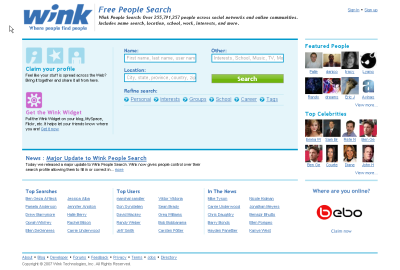
You can't really argue with a simple, clear three-column design. Here's how it compares to Wink and Pipl:
As you can see, Pipl is easily the least cluttered, and whilst Wink offers more functionality and widgety-style goodness its design clarity suffers a little. So, from an aesthetic point of view, Spock gets the B+ Could Be Better grade for now.
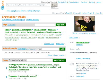
But what of its functionality? Something nice about Spock is that they do some of the legwork for you. They'd already part-filled my personal information by aggregating it from the publicly-available information from sites like MySpace, Facebook and LinkedIn:
Nice! I added a few more things, tags, web sites, and corrected my birthday, but my About info, my picture and some starter tags were already there. That's immediately one up on Wink, where I had to add all my information after signing up.
Everything on Spock revolves around their Ajax tagging engine: Tags, News, Related People, Web Sites... It's dead simple to add some News, you just type in the box and hit Add.
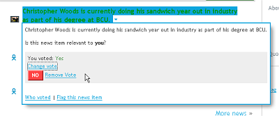
Job done. However, if you made an error or want to delete it, it's just as simple - just click on the dropdown next to the entry, which brings up this menu:
Then, just click on Change vote, and it offers you the chance to remove your vote for this news item, which effectively deletes it completely.
I had slightly less of a fluid experience with Wink; when I signed up, I had to add all my content from scratch, and when I tried submitting my Facebook information so it could scrape my vital statistics for me, it didn't work, submitting me to the next page with the information only part-filled. I had to add the other info myself.
When I got to the page where I could import other data (based on in-page Ajax widgets), I filled in some info, opened the Facebook widget and entered my data again...
... Hit submit, and bam - back to the page I was just on, with none of the data there! So, re-add Twitter, re-add my two URLs, re-add my Skype info... No huge deal, but it still didn't work. Spock on the other hand prefilled some of the info entirely on its own, so Brownie Points there for that.
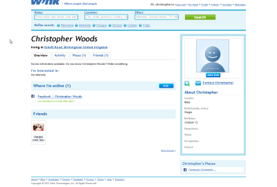
My profile page looks a bit barer, too:
So I'm not as impressed with Wink as I am with Spock, and that's without having pre-submitting any of my data to Spock or installing cheeky Facebook widgets that aggregated my data in preparation for my signup.
On Finding Others
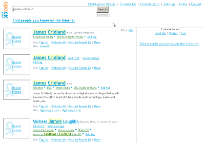
Spock excels in this area; it's really user-friendly, requiring little or no acclimatisation time to get your head around how it works. The ease of use is down to its unified architecture; all types of search basically revolve around various tagged entries for people, with collections of metadata. When you search for someone with the basic search (I simply searched by name in this example), you get a results page:
From there, you can click through to entries' pages. For people who haven't signed up themselves, but for whom Spock has a lot (or duplicate) data, there'll be several entries - when you sign up, you can merge duplicate information into one profile, another timesaving feature (and nice application of foresight).
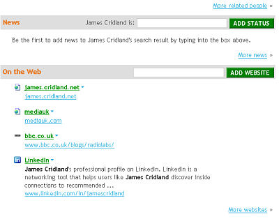
I decided to add some information to Mr. Cridland's profile, to give him a bit of a headstart, which is easily done - once he signs up, he can additionally approve of any tags or info I've added (by clicking the appropriate Relevance button in the dropdown for each item), or he can remove them completely in the same amount of time.
There, couldn't be easier. Though to be honest, his LinkedIn and MediaUK links were already there on another duplicate entry, but I thought there'd be no harm in adding them to his most complete profile. Hopefully he'll register and complete his details!
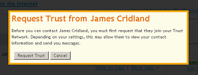
Another interesting feature is Spock's Trust Network - a smaller network of established friends, who have to approve any Trust requests, but who then have higher privileges regarding your account (they can message you and view contact information), which is something I was hoping was available.
If he doesn't approve my request, I might have to go have a little cry...
You can also establish relationships between people by entering the specifics on their profile page.... This time, I found my housemate's most relevant profile, and established a relationship:
Easy peasy! I just clicked You, and it autofilled my name, and then I just entered the relationship type and hit Add. Oh, and I also invited him to sign up while I was at it.
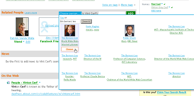
Establishing relationships for two other people is very easy, and reminiscent of Wikipedia - you just search for them and choose from a list. An example:
Step 1: Search for a fairly famous person (using Advanced Search, this time, just to see if it differed in results from the basic search).
Step 2: scroll to Related People, search for another (related) well known person:
Step 3: Type in their relationship and hit add:
I noticed that as I typed 'peer', the search box kicked back some related results - very nice. Live, as-you-type search is going to be helpful if you expect multiple choices and you're not sure which is going to be the most appropriate selection, but it's pretty obvious which one to go for in this case. Good to see the designers planning ahead, though.
You can also embed a profile into your page as a Flash or text widget, which will also dynamically source images, text and related info from your profile on every load - that's kinda funky too, and I might put that on this site. :)
So, as you can see, Spock is generally quick, easy and painless to get around and contribute to!
On The Power Of Spock
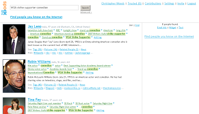
Ok, here's where the really cool stuff comes in. So, you want to search for people related to an event? Sure, go ahead - type in something. Here, try "WGA Strike Supporter":
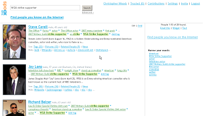
You'll get results for people with that tag. But wait, you want to hone your search down a little more? How about WGA Strike Supporters who are also comedians? Simple, just add the extra tag to the search box and search again, or choose one of the suggested refinements from the right hand side. Doing that gives you something a little like this:
Now you have to agree that this is probably Spock's coolest feature. These tags can be added or voted up or down by fellow contributors, with their Spock Rating functioning as a weighting to help bias the emphasis of their contributions in a positive or negative way so as to improve the overall experience for everyone. It also means that you can spend ages clicking through, exploring relations, contributing to people's tag clouds, expanding the known information about them and generally doing half the work of a search robot - but (hopefully) in a more accurate and intelligent way, which will result in more concise and relevant results for people searching for entries in the future.
Pipl is also an excellent contender, but is slightly different again, indexing the Deep Web and offering purely automated results (for example, I searched for my name and received my LinkedIn profile link at the top of the results, but that was the only relevant result on the entire page). So, for the moment, until you have an established presence in the Deep Web, Pipl is maybe not the best venue for being discovered via.
Whilst sites like WikiYou (which bills itself as "the unauthorized biography of every person on earth") base their appeal on the fact that everything about everyone is always editable, I don't find that as appealing because you're far more open to slander and nasty things written about you - I don't think a wiki-based site is maybe not the best idea for a social information and aggregation platform. I prefer to keep a much tighter control on my own personal information and related information if I can, and although you get notifications when your personal information or profile is edited, I'd hate to have to police my WikiYou profile every day for as long as I was interested in retaining it just to keep it 100% accurate... For famous people who'll have a lot of interested parties viewing their profiles, it's much more likely that their profiles will be kept clean of the crap purely based on the helpful people to unhelpful people ratio, but for little old me it's not the best model to pursue. So, Spock wins - for now at least.
Anyway, remaining bugs and teething troubles aside (duplicate profiles etc), I really like this concept, and I think Spock is going to be one of those sites I actually continue to actively use and update. Give it a go, see what you think!
0 Comments:
Subscribe to:
Post Comments (Atom)


